.svg)
Lead generation is the lifeblood of any business. If you’ve been struggling to generate leads, it’s going to be difficult to have any kind of sustained success. Simply, your contact pipeline will dry up fast. That means no sales and, of course, no revenue.
That’s where landing pages come in.
Whether you’re a start-up working on your SEO or an established company trying to grow your newsletter, an effective landing page helps you generate more leads and increase sales.
In this post, we’ll share six lead-generation landing page examples to help you create a landing page that works for your business. But first, let’s talk about what a landing page is and the best practices for landing pages lead generation.
What is a Lead Generation Landing Page?
A lead generation landing page gathers contact information from your visitors. It’s where your visitors “land” after they click on a link, button, or ad from your newsletter, a search engine, your socials, or anywhere on the web.
Even though your landing page has the single purpose of collecting information, it’s invaluable. This will help you to engage your visitors, cultivate a relationship with them, get to know their needs, and convert them into customers.
Landing Pages Lead Generation Best Practices
Your landing page should have your fingerprints all over it. It should represent your brand’s style, voice, and feel.
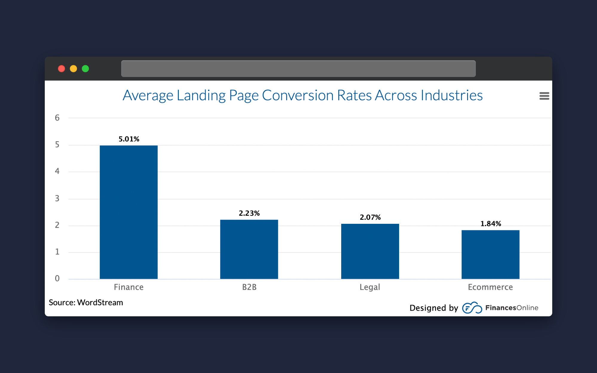
But you can’t just put whatever you want on a landing page. Every landing page must be optimized with several key elements to increase the likelihood of generating more leads for your business. With landing page conversion rates somewhere between 2-5% depending on your industry, you can’t afford to wing it.
These are some of the best practices for landing pages that will help you optimize your page to jumpstart your lead-generation efforts.
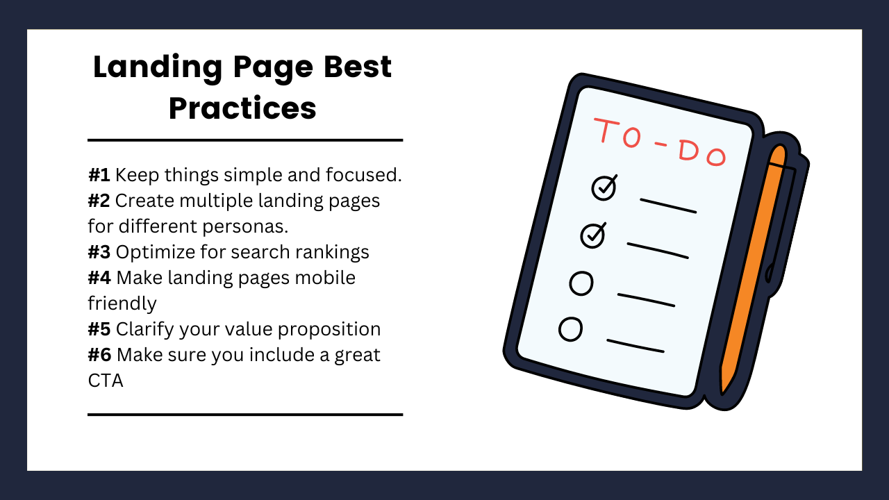
#1 Keep It Simple and Focused
Landing pages should have one–and only one–goal. The wide world of the internet is full of attention-grabbing opportunities. While a consumer is on your page, if there’s too much going on, they’re likely to bounce out.
But to convert your traffic, you must keep your visitors’ attention with a simple, one-track process.
First, decide what it is you want them to do. Is it to subscribe to your newsletter, provide a contact number, or get a demo of a new tool? Is it to donate to charity or sign up for a webinar?
Whatever it is, that is the page’s sole purpose for existing. Every single element on the page is driving toward that goal and helping your visitors make that choice.
A successfully crafted landing page means visitors have only two options: they accept the offer or leave the page.
#2 Create Multiple Lead Generation Landing Pages for Different Personas
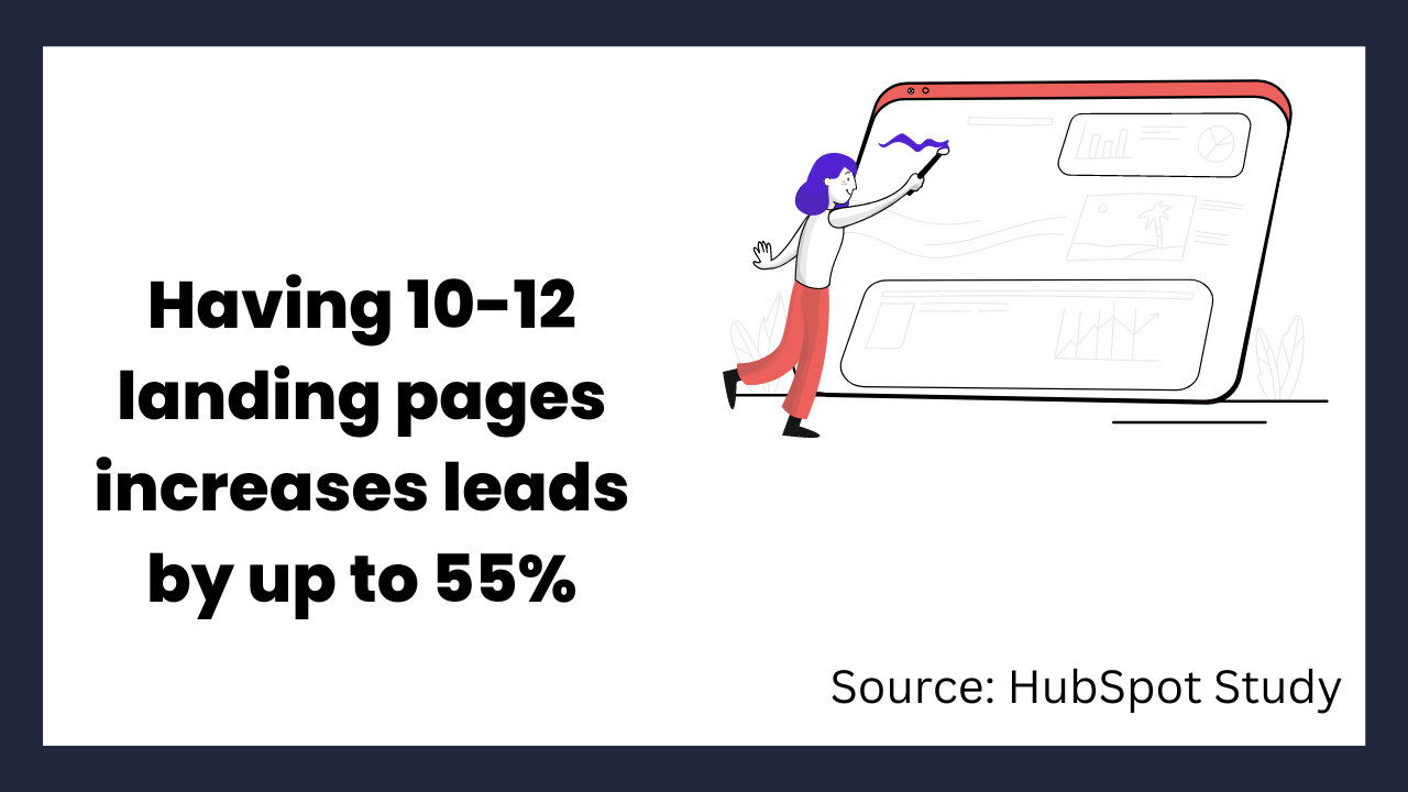
If you have multiple audiences within your contact list that you’re targeting, then this is for you. Using audience segmentation, you can divide the audience based on their demographics, interests, purchase history, or other variables. Then you can create specific pages for each group that caters to their particular interests.
#3 Optimise for Search Rankings
Having a stunning landing page that offers something awesome isn’t enough. If your page isn’t optimised to rank well on Google, then no one will ever find it. You have to optimise your page for search engines.
There are thousands of articles out there about SEO tips for developers. But you don’t need to know how to code. Focus on these essentials to make sure your landing page will rank:
- Choose the right keyword phrase.
- Title tags, meta description, and heading structures.
- Create quality content–but don’t write a novel.
- Add high-quality visuals.
- Use alt tags for pictures and videos.
- Watch your page loading speed.
#4 Make It Mobile Friendly
If your landing page only looks good on a laptop or a large monitor, you’ll miss out on a whole lot of potential customers. Why? About 60% of online searches are done with a mobile device.
That means you must ensure your landing page is a responsive design.
This isn’t just about making sure your page is pretty–as important as that may be. It’s about a quality user experience for the singular mission of your page: to get visitors to do that one thing you want them to do.
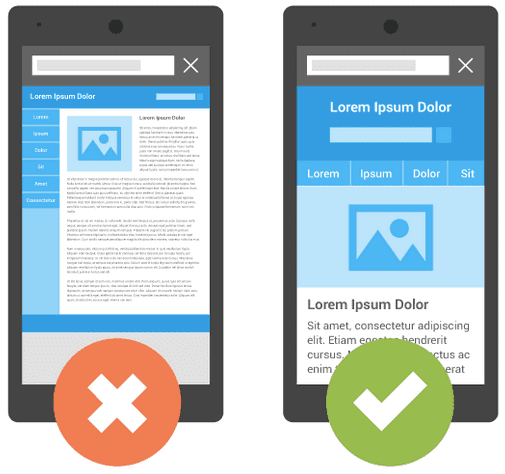
Some things to keep in mind for mobile responsive design:
- Is your text easy to read and images easy to see?
- How’s your whitespace? The text shouldn’t go from edge to edge on the screen.
- Is the CTA button easy to find and tap?
- Are your images optimised? In other words, make sure they aren’t so large that a mobile device can’t load the page. (No conversions if the page never loads!)
#5 Clarify Your Value Proposition
Your value proposition is what makes your business stand out from others who sell the same thing you do. In other words, why should the person on your landing page stay there? Why should they trust you instead of the other guy?
This is something that should already be worked out from a strategic branding perspective, by the way. It’s not created on a whim.
The important thing here is that you communicate clearly on your landing page.
#6 Write a Compelling Call-to-Action
The call-to-action (CTA) button on your landing page is the centerpiece. It’s the one thing that should ease any tension and help your visitor feel like you are adding value to their lives once they click it.
Your CTA should do two things: be clear on what the visitor is getting and that it’s a call to action.
You can communicate clearly what they are receiving by using specific language like, “Get My Free eBook” or “Try Demo now” rather than “Submit.”
And you can visually display that it is a CTA by making it a button (i.e. text inside a box) and using bright or contrasting colors with bold, easy-to-read font.
6 Quality Lead Generation Landing Page Examples
With all of these best practices in mind, let’s take a look at six examples of landing pages that are crushing it.
1. Airbnb
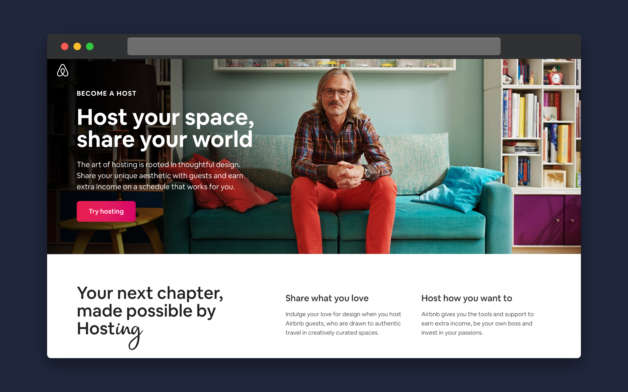
Airbnb has designed this landing page to attract people to host their living spaces. The page’s journey lets potential hosts hear from current hosts, see their income potential in their location, and learn how hosting works.
There are multiple CTAs on the page. “Get Started” occurs twice and is in bright red. Two other CTAs offer the opportunity to talk with an Airbnb “superhost” or to join the Airbnb host newsletter to learn more.
Given the nature of Airbnb’s business, they include an important section on how new hosts will feel supported and protected against guest incidents, accidents, and Covid-19 complications.
As always, Airbnb does a wonderful job with healthy margins, plenty of whitespaces, and stunning images.
2. Bluehost

Bluehost is one of the most popular web hosting companies in the world. This landing page is a special promotion for a discounted monthly hosting rate.
The page tells the visitor what they're getting. The price for hosting is clear and above the fold. A slight scroll down explains the asterisk next to the $2.95/month.
The CTA button is contrasted with the page. It uses specific, action-oriented language.
Visually, notice the image's prominence and the mood it evokes (ease, happiness, carefree). And the space isn't cramped. Plenty of room outside of the text areas.
Bluehost also has a helpful chat button at the top of their landing pages that helps visitors with questions communicate with a support representative ASAP.
Adding chat to your website could also help conversion rates. Recent statistics show that 42% of website visitors claim that a company is more trustworthy if they offer live chat support.
3. Wix

Wix is a popular website builder. Their landing page is a masterclass in simplicity, design genius, and user experience. The CTA is clear and bold right in the middle of the page. The mountain pointing to the box is a beautiful touch.
As you scroll the page, you aren’t met with a lot of text. Instead, the waterfall from the mountain takes you on a journey of what Wix can offer you (their value proposition) with the same CTA all along the way.
The only problem with this landing page is that it’s almost too stunning. Visitors may not want to click “Start Now” and navigate away from the page!
4. Curology
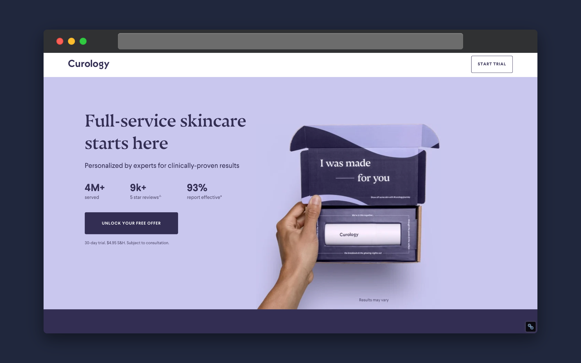
Curology is a skincare company that specialised in personalised skincare products. This landing page is for a free offer starter pack. It features a clean design, with gentle color tones. The copy comes in at a crisp ten words and features some eye-popping statistics.
The image of the product’s box with the words “I was made for you” shows how Curology is set apart from its competitors–they provide a one-of-a-kind product for their customers.
The CTA is obvious with its dark contrast. “Unlock Your Free Offer” excites the reader much more than “Submit” or “Subscribe.”
Finally, everything is above the fold. Scroll down and all you’ll get is footer information.
5. Retail Me Not
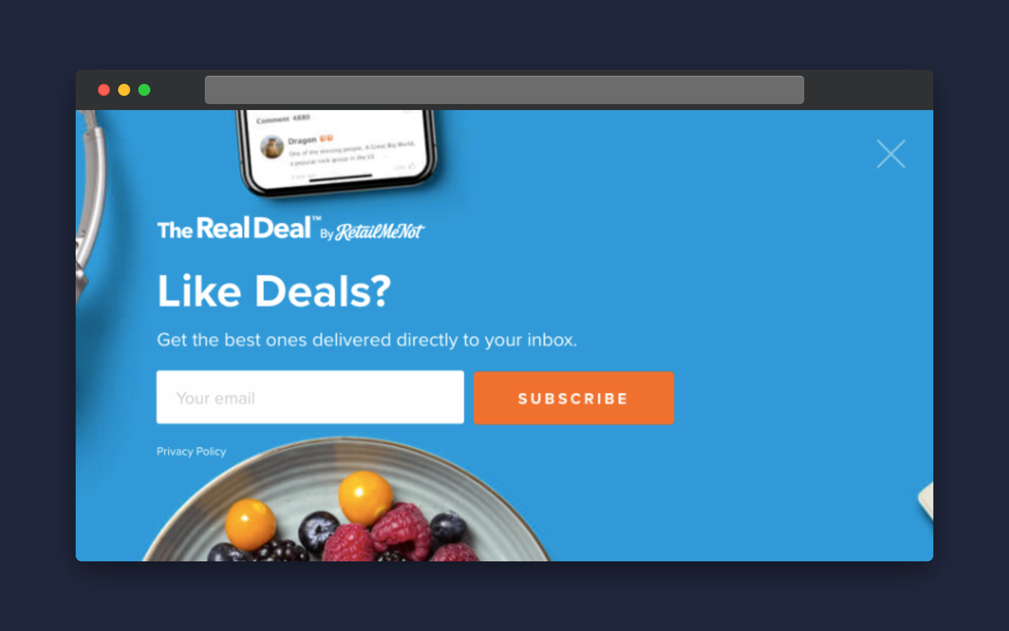
Retail Me Not is a major online deal and coupon site. They incorporate a pop-up into their landing page. It’s clean, simple, and laser-focused on their goal: getting newsletter signups.
They use the keyword “deals” in their question to entice visitors to sign up. Retail Me Not banks on the fact that everyone on their site wouldn't want to miss a good deal.
The CTA is clear. They’re just asking for your email–no phone number or even a name. The button could be a bit more creative, however. “Get Me Deals,” “Let’s Deal,” or something more compelling would be nice. Still, if the goal is to get to the point, then “Subscribe” can still do the trick.
6. Radical Design

We included Radical Design because it’s, well, radical. It departs from typical landing page design etiquette and makes a bold statement. And it should–this landing page is designed to get web developers to sign up for a course to make web designs less boring and more memorable.
Radical Design opts for a longer landing page. But it doesn’t lose attention. Its fun, humorous, and fast-paced copy keeps you scrolling and wanting more.
The page gives a clear value proposition and shows what the user will get–and not get–if they take this course. The CTA appears just under the fold and then again at the bottom of the page.
Sandwiched in between the CTA and the description are testimonials of other developers who attest to the author’s experience and skills.
Wrapping It Up
Landing pages help you add more contacts to your pipeline because the page is focused on one goal: collecting contact information. Once you have contact info, you can add value to their journey, nurture the relationship, and, hopefully, make the sale.
We’ve shown you some of the best landing page examples. With all that inspiration, it’s time to get working on your landing page or give the one you have a refresh. Use our website lead generation forms to get started today!